Migrating Email on Commission into a unified navigation
Overview
Ad Portal is Sojern's platform for Customer Success Managers, digital designers, and internal teams to set up, manage, and report on advertising and email marketing campaigns for hotel, destination, and corporate clients. As Sojern consolidated its Email on Commission (EoC) product, previously run through a legacy platform called Guest Experience Platform (GEP), into Ad Portal, the existing navigation had no clear home for the incoming functionality.
I worked alongside a senior designer on the research, information architecture, and visual design behind the migration, contributing across navigation strategy, cross-functional workshops, and page-level redesign. My focus was making sure a whole set of new features could land in Ad Portal without making an already busy navigation harder to use.
"A migration is a chance to fix the structure a feature never had a say in, not just move it to a new address."
Problem
Ad Portal's navigation had grown into a dense list of more than fourteen sections with no consistent structure, inconsistent active states, and no clear grouping logic. That was already creating friction for CSMs well before EoC entered the picture.
Layering an entirely new set of functionality onto that structure (account configuration, merge tags, guest audiences, email performance reporting) risked making a strained navigation worse. At the same time, EoC's power users, the digital design team who build the email campaigns, had never had a voice in how Ad Portal's IA was organised, because their workflows had lived entirely in GEP.
-
Fix the underlying navigation model A flat list of fourteen plus sections taught users a different mental model in every section.
-
Find the right home for an incoming product EoC was arriving from a completely different system and needed a logical destination inside Ad Portal.
-
Bring power users into the decision The digital designers who build EoC campaigns had never had input into Ad Portal's structure.
Research
I collaborated with a senior designer throughout and grounded the work in how people actually use Ad Portal today, rather than assuming the new IA could simply bolt EoC on top of the existing structure. Some pieces I owned end to end, and others I contributed to as part of a wider effort.
Navigation audit
I ran a structured UX audit of the current Ad Portal side navigation, looking at hierarchy, active states, consistency, and interaction behaviour. It surfaced thirteen findings with a single common root cause: the navigation taught users a different mental model in every section.
Parent items behaved inconsistently on click. Some auto-selected a child, some landed on their own page, and one jumped straight to the second tab instead of the first. Active-state indicators disappeared when a child page was current, and the collapsed icon-only view gave no location feedback at all. This told me that before EoC could be placed anywhere, the container itself needed a clearer, more predictable structure.
Annotated audit screens showing the inconsistent active states and click behaviour across sections.
User and CSM research
Alongside the audit, I drew on a broader body of CSM research: working sessions with Hotel, Destination, and APAC segment CSMs, plus a survey of twenty-two respondents. I participated in these sessions, which were led by a senior designer. They consistently showed CSMs stitching workflows together across Ad Portal, Salesforce, Tableau, and personal spreadsheets, because Portal's existing structure did not map to how they worked account to account. That reinforced what the audit had already surfaced: navigation needed to follow task flow, not just list every feature flat and alphabetised.
Session notes and synthesis from working sessions across the Hotel, Destination, and APAC segments.
Workshop with digital designers
Because digital designers are the primary users of EoC functionality, I led a dedicated card-sorting workshop with them to understand where they instinctively expected EoC items to live inside Ad Portal. On a Figma board, we sorted individual EoC building blocks (account configuration, PMS integration, merge tags, guest audience lists and segmentation, and the email performance dashboard) against the proposed IA groupings.
Placement was mostly intuitive. PMS integration and merge tags fit naturally under Accounts, and audience lists under Audiences. A few items exposed real ambiguity worth resolving deliberately rather than by default, most notably whether email performance belonged under Dashboards or Reporting, since Ad Portal already used both terms inconsistently for similar content.
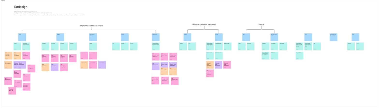
Card-sorting workshop board. Digital designers sorted EoC building blocks against the proposed groupings, which surfaced both the intuitive placements and the genuine edge cases.
Competitive research
To sanity-check the direction against the category, I audited how comparable platforms structured navigation for similar multi-product, multi-account workflows: Cendyn, Cloudbeds, Siteminder, RevINate, Epsilon, AdRoll, Hulify, Epom, and Brew. This surfaced patterns worth borrowing, chiefly grouping by user intent (setup versus monitoring versus resolution) rather than by product name, and keeping account and campaign configuration visually distinct from performance reporting.
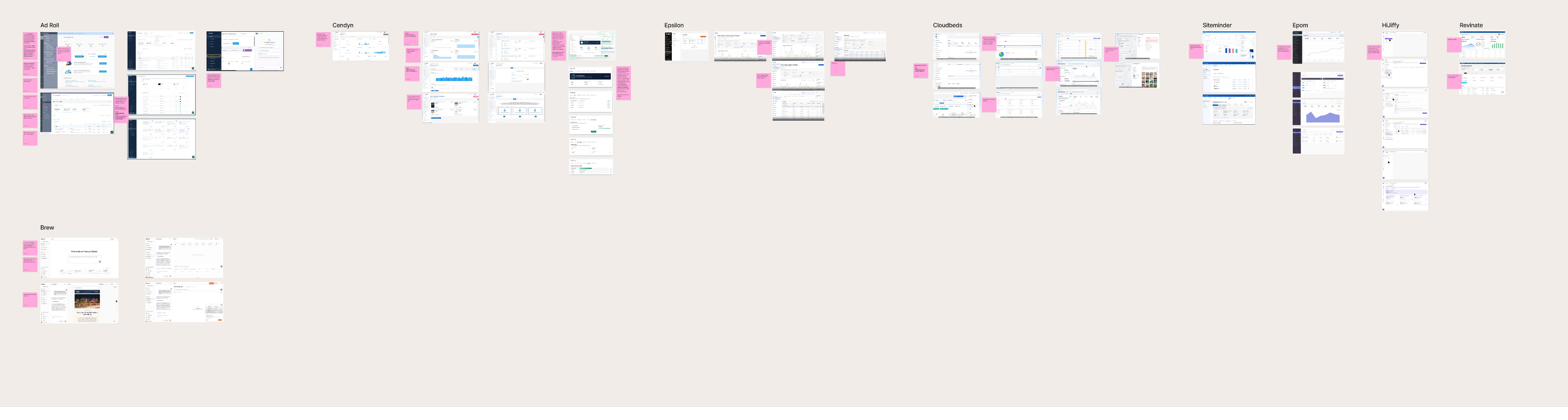
Nine comparable platforms, reviewed for how they group multi-product navigation.
Mapping the information architecture
With the audit findings, workshop input, and competitive patterns in hand, I worked with the senior designer to map the current Ad Portal IA in full, so we could see where the fragmentation was actually happening, then worked through several structural options for where EoC could sit.
The current IA was flat. Top-level sections sat side by side with no grouping logic connecting them, which is part of why the audit's core finding, that there was no single rule the interface taught users, held true. Together with the design and product team, we proposed reorganising the flat list into three intent-based groups: Workspace (Accounts, Campaigns, Asset Management, Programs, Audiences, the day-to-day setup and management surfaces), Insights (Dashboards and Reporting, where monitoring and analysis happen), and Resolve (Billing and Help, where users go when something needs fixing). That gave EoC's incoming functionality a logical destination instead of forcing a new top-level category of its own.

Before. A flat tree with sections side by side and no connecting logic.
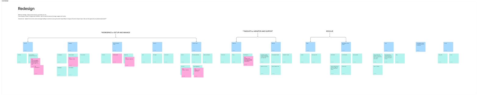
After. The flat list regrouped into three intent-based groups: Workspace, Insights, and Resolve.
Three IA options
From there we developed three options for how EoC items would slot into the structure.
- Kept the existing flat top-level list, distributing EoC's Account Configuration, PMS Integration, and Merge Tags into Accounts, Guest Audiences into a new Audiences section, and Email Performance into Dashboards.
- Refined Version 1 by tightening naming and removing a duplicate Merge Tags placement under Asset Management to cut redundancy.
- Kept the same placements as Version 2 but added the Workspace, Insights, and Resolve headers above the existing items, turning the long flat list into three legible, scannable groups.
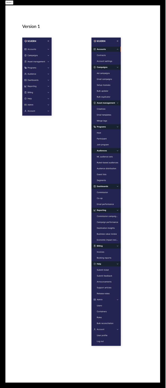
Version 1 · flat list
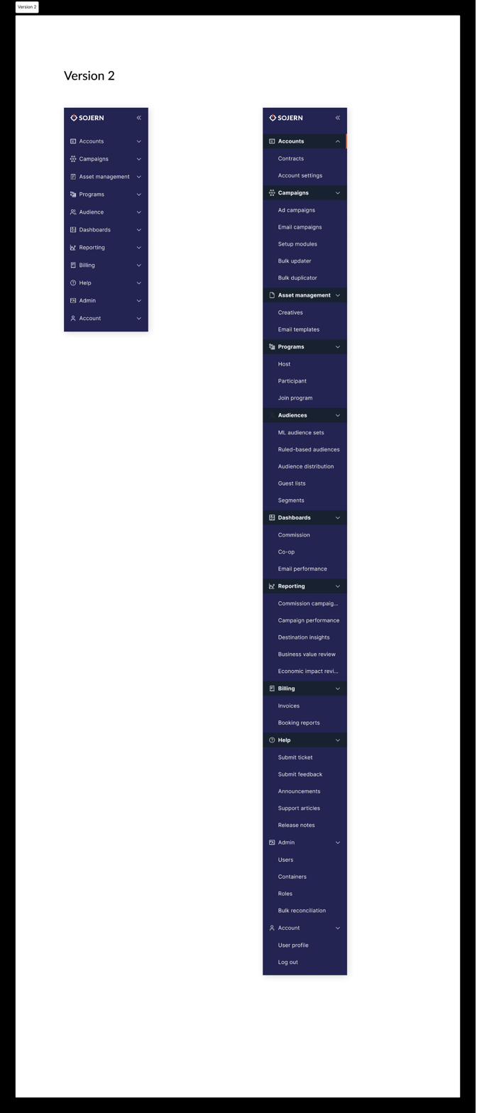
Version 2 · refined

Version 3 · grouped Chosen
The three navigation versions explored, from a refined flat list through to the grouped structure we chose.
We chose Version 3. It did not just find a home for EoC, it fixed the structural problem the navigation audit had flagged in the first place, and it matched the mental model CSMs and digital designers had already described in research: setup and day-to-day account work in one place, performance and monitoring in another, and billing and support as a distinct third bucket. Card-sorting had confirmed that PMS integration, merge tags, and account configuration read naturally as Accounts work, while audience and segmentation data read as its own category, both of which Version 3 preserved while adding the missing top-level clarity.
EoC page redesign
With the navigation home settled, I turned to the EoC screens themselves, which were migrating out of GEP's older interface. I led the redesign of the integration and account configuration screens and carried the work through the audiences section, partnering with engineering and the CSM and onboarding teams who configure these settings. Across that work I:
-
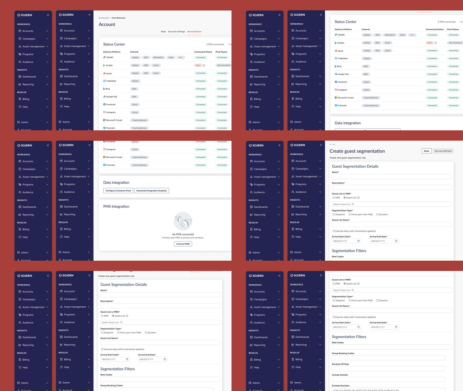
Consolidated three legacy screens into one GEP's separate Venue Information, Guest Engagement Options, and Common Options screens became a single Email and Commission section under Account Configuration, since the underlying fields were all set by the same users at the same point in a property's lifecycle.
-
Kept a pattern users were already fluent in Retained the existing toggle-based interaction for configuration flags (cart abandonment, external email validation, PMS opt-out overrides, AI email builder, guest name display) rather than introducing checkboxes, since CSM and onboarding teams already knew that pattern from GEP and a mid-migration control change would have added needless relearning.
-
Rebuilt the visual layer Every migrated screen was brought in line with Sojern's current brand guidelines and Ad Portal's UI kit, replacing GEP's older visual language with Portal-native components, spacing, and type.
-
Preserved proven flows Merge Tags and Audience (Lists and Segments) management carried over with their existing import, export, and filtering intact, since research confirmed CSMs relied on it as-is and Phase 1 focused on new configuration needs.
I worked with product management to sequence this as a phased rollout, prioritising net-new configuration screens that needed design support first while deliberately not duplicating settings that already lived elsewhere in Portal. Throughout, I partnered with engineering so that field-level requirements, such as the Reference ID needed to generate unsubscribe links, were captured accurately in the handoff.
The legacy GEP screen next to the redesigned Portal-native Email and Commission configuration screen.
Outcomes
-
A predictable, task-aligned structure Replaced a flat, inconsistent navigation of more than fourteen sections with a three-tier grouping model (Workspace, Insights, Resolve) that gives every item, old and newly migrated, a home that follows how people work.
-
Power users had a say for the first time The digital design team gave direct input into where their tools live in Ad Portal, rather than inheriting placement decisions made without their workflow in mind.
-
One system of record Retired GEP as a separate system for email and commission configuration, consolidating CSM and onboarding workflows into a single platform.
-
Settled a longstanding naming ambiguity Resolved the internal "dashboards versus reporting" inconsistency as part of the IA decision, rather than letting it carry into the new structure by default.