Streamlining class rebooking in the Beat81 app

Why should booking the class you take every week feel like starting from scratch?
Beat81 runs popular fitness classes across Germany, with a companion app for booking them. Most people who use it are creatures of habit. They go back to the same coaches, the same studios, the same class formats, often on the same days. The app did not reflect that. Every booking started from zero, so rebooking a regular class meant searching, filtering, and navigating the same loops over and over. According to recurring user complaints, a repeat booking could take more than twenty steps.
This was a self-directed project. I owned the research, design, and testing end to end.
What rebooking takes today
Before. Rebooking a class users already attend, as the app works today. Scroll inside the frame to follow all 26 steps.
The redesign: rebook in two taps
I gave saved classes a home people do not have to go looking for, and built saving into a step they were already taking. As a result, repeat booking went from more than twenty steps to as few as two.

Saved classes on the home screen

Saving a class puts it in a swipeable row on the home screen, each card carrying the day and time so the next one comes first. Before users have saved anything, the row fills with their go-tos, so it never sits empty.
The schedule, narrowed to familiar classes

The bookmark in the filter bar cuts the day down to a user's saved classes. When none of them run that day, the app explains why it is offering alternatives instead of showing an empty screen.

Saving where users already are


After every workout, the app opens on a short feedback form before users reach the home screen. They see it anyway, and the class is still fresh in their minds, so I added a bookmark to the form's header to save it right there. For classes they attend often, the form also suggests saving them.
How the first version came together
To get here, I mapped the existing booking journey step by step and documented everything it took to rebook a class I had already attended. That surfaced the core problems: high memory load, repeated navigation loops, and slow filtering. I benchmarked other sports and fitness apps and kept coming back to one pattern, saving and favoriting to speed up repeat actions.
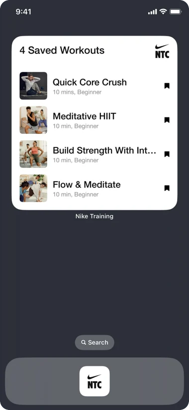
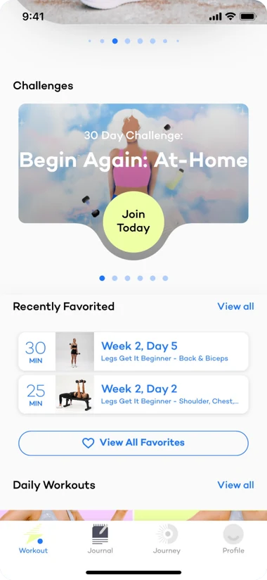
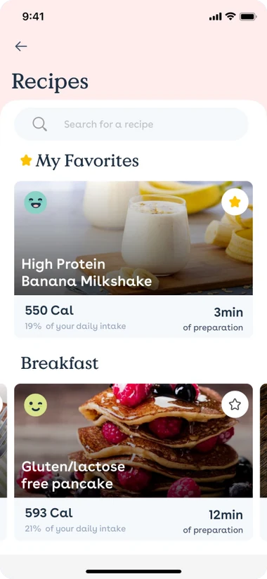
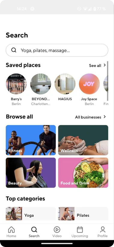
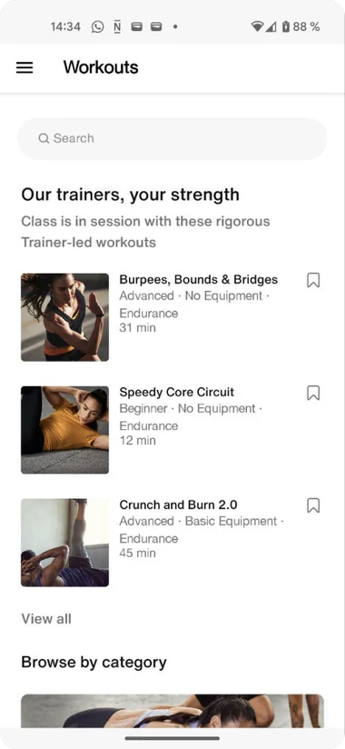
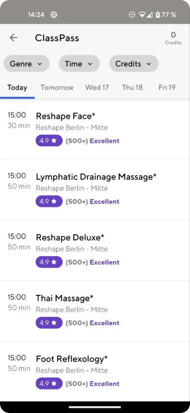
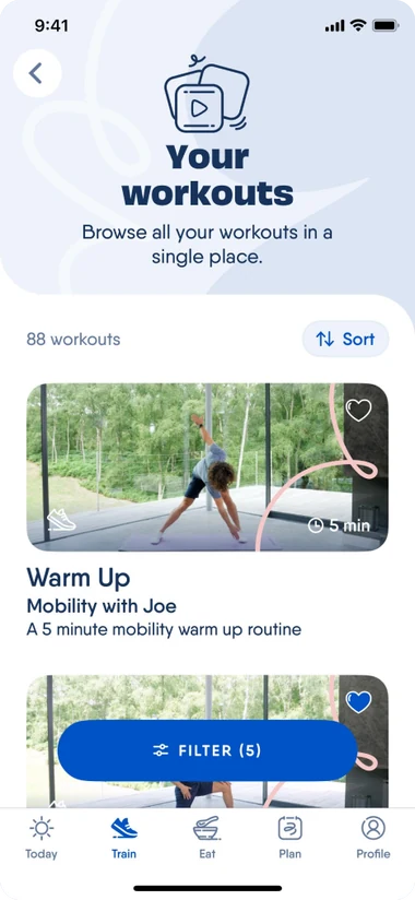
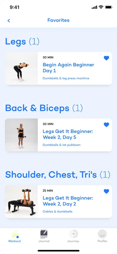
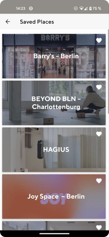
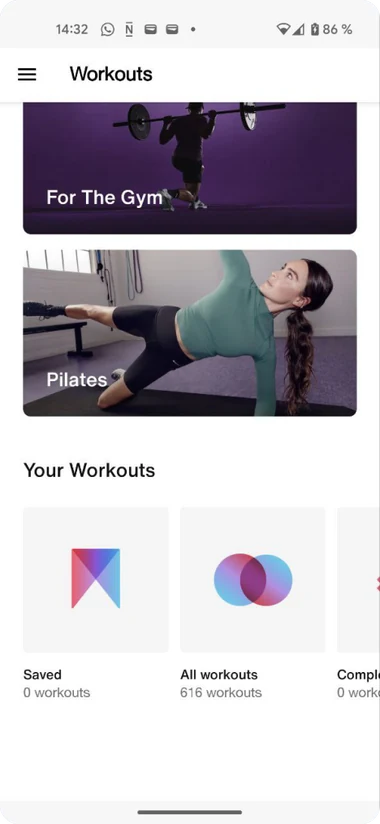
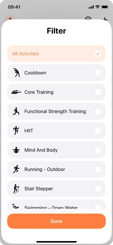
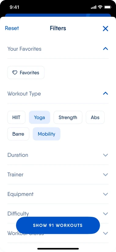
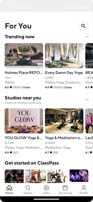
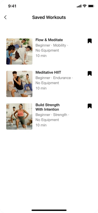
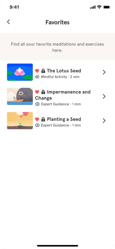
Benchmarked apps, and how each lets people keep and return to what they use most.
I sketched several ways it could fit Beat81, carried the strongest into two rebooking paths, and set others aside.
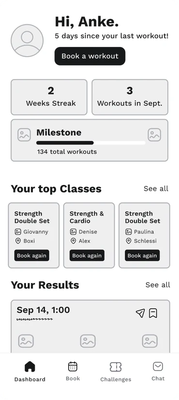
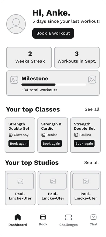
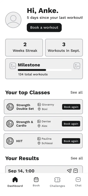
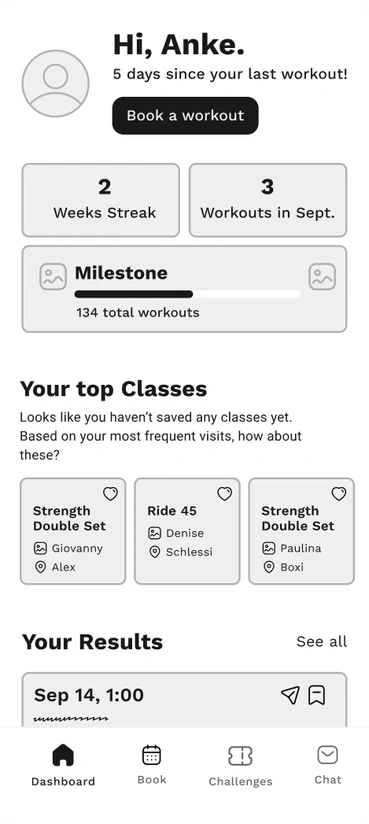
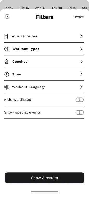
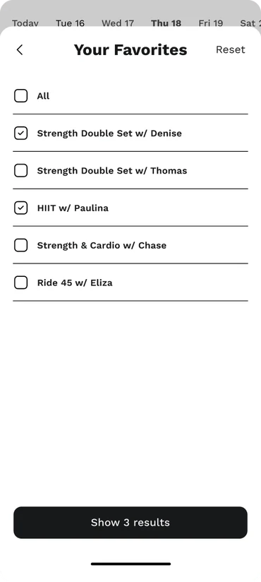
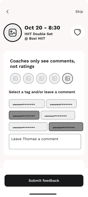
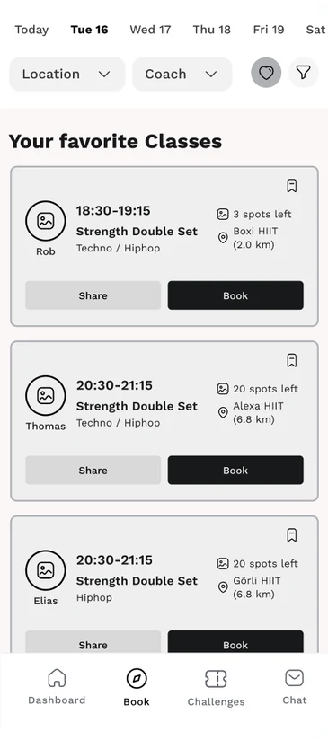
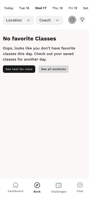
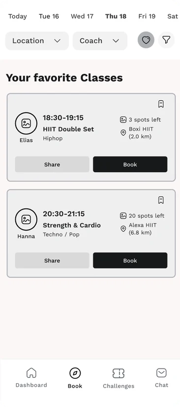
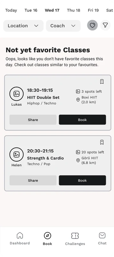
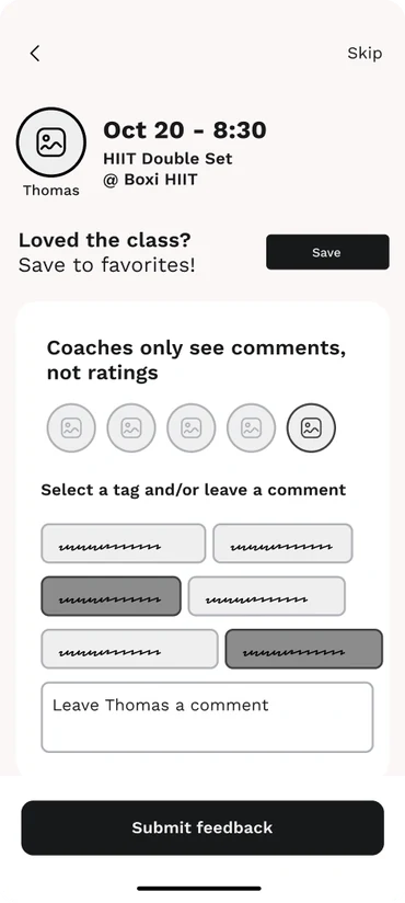
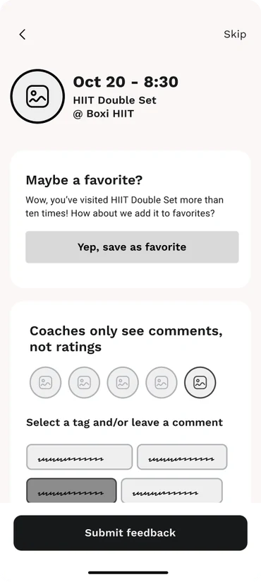
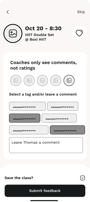
Wireframes of the first version, before testing reshaped it.
Then I built a prototype and put it in front of users, which is where the design actually took shape.
The key decisions came out of testing
I ran five in-person moderated usability tests with the two user types I had defined earlier: the Routine Athlete, who rebooks the same classes, and the Explorer, who books more openly. I measured time on task, confidence, and visible confusion or delight. The prototype was fast, and a few participants reacted with plain relief ("Cool. That was easy."). But the sessions also broke four of my assumptions, and each one needed a design decision.
Is it a favorite, or is it saved?
I first called the section "Favorite" and used a heart icon. Three of five participants were unsure what it meant, and some missed the heart state entirely. A favorite suggests sentiment, but users wanted a practical shortcut.
I renamed it "Saved classes" and swapped the heart for a bookmark. It was the smallest change in the project and one of the most consequential, and it set how much weight I gave copy from then on.
What do you show when the class isn't there?
When a usual class wasn't on the schedule, the app showed recommendations under "Not yet favorites." Three of five participants didn't realize these were recommendations, and some read the screen as an error.
I chose to be explicit over vague and rewrote the label to "Suggested based on your go-tos," so the screen explains why these classes appear.
A saved class needs to know your week
I assumed a saved class was about the workout and coach. In fact, four of five participants booked around specific times and locations, and two tried to swipe the dashboard row expecting more than three items.
I added day and time to each card, sorted the list by the next upcoming class, and made the dashboard row a swipeable carousel. The card stopped being a label and became a planning tool.
What counts as one saved class?
Participants disagreed on what defines a saved class: the coach, the time and location, or something else when a coach is substituted. Leaving it open would make saved items unpredictable.
Since convenience drove their choices, I defined a saved class as format, location, and day and time. It is not the only valid definition, but it is stable, and a shortcut is only useful if it always points to the same thing.
Impact
- Rebooking dropped from more than twenty steps to as few as two.
- Task times landed around thirty seconds from the Book tab and as fast as five seconds from the dashboard.
- Every confusion point above was traced to a specific cause and resolved in the same round, with the fixes ready to validate in a second test.
The clearest signal was qualitative: routine users, the people who feel the old friction most, moved through the new flow quickly and with visible ease.
What stuck with me
The biggest lesson was how much the design depends on UX copy. Most of the usability problems I found came down to words. Users skipped explanatory text and read only headings, so one unclear label could undermine an otherwise sound design. I now treat naming and microcopy as part of the design from the start.
I also became more confident running mobile usability tests, from planning sessions to moderating without leading. And I used AI more deliberately, combining ChatGPT, Otter AI, and Notion to synthesize the research findings, which I want to keep building on.
Next, I would run a second round of testing to confirm the Saved classes changes, and redesign the Book tab filters, which users still found awkward in map view and when filtering by coach and format.