AI-First Design-to-Code Workflow
Overview
This project started as a proof of concept to test what AI tools like Cursor could do when Figma components and code were tightly aligned. It grew into a cross-functional effort to close the long-standing gap between Sojern's design system and its MUI based front end, and to decide, as a company, what an AI-assisted design-to-code workflow should look like at Sojern. The broader goal is to use AI tools to generate front-end code directly from design, cutting build time, building more consistently across the platform, and reducing the manual design auditing needed after the fact.
I worked alongside our lead product designer across this effort, from the early workflow exploration and proof of concept through the cross-functional alignment review, the component audit, the Figma library update, and the team alignment on how the work would be owned and carried forward. Within that, I owned the hands-on implementation in our Figma component library and much of the component-level auditing.
Problem
Sojern's front end is built on Material UI (MUI), but MUI doesn't fully match Sojern's design system or product needs. Engineers have historically closed that gap with custom styling, overrides, and ad hoc components. Over time this created visual drift between Figma and production, repeated implementation work, and design QA that was reactive and screen by screen rather than system driven.
Key Decisions
-
MUI theme alignment over a fully custom repository. After the initial proof of concept showed a custom Git repository could reach 95%+ code-generation accuracy, the team weighed that against the cost of maintaining a fully custom library. Given current engineering resourcing and the value of MUI's built-in troubleshooting and community support, we decided to invest in aligning and extending our existing MUI theme rather than replacing it outright.
-
Audit before alignment. Rather than jumping straight into fixing components, we agreed to audit the existing repository first, component by component against Figma, so design and engineering could prioritise from evidence rather than assumption.
-
Hardcoded values first, components second. Within the alignment work, we chose to tackle hardcoded styling values before component-level fixes, since resolving tokens first reduces rework once component alignment begins.
-
Rotating tiger team over a dedicated team. To keep the work moving without pulling a team off roadmap indefinitely, ownership of the alignment effort rotates each sprint, with bandwidth carved out from a different product team each cycle.
Process
Proof of concept
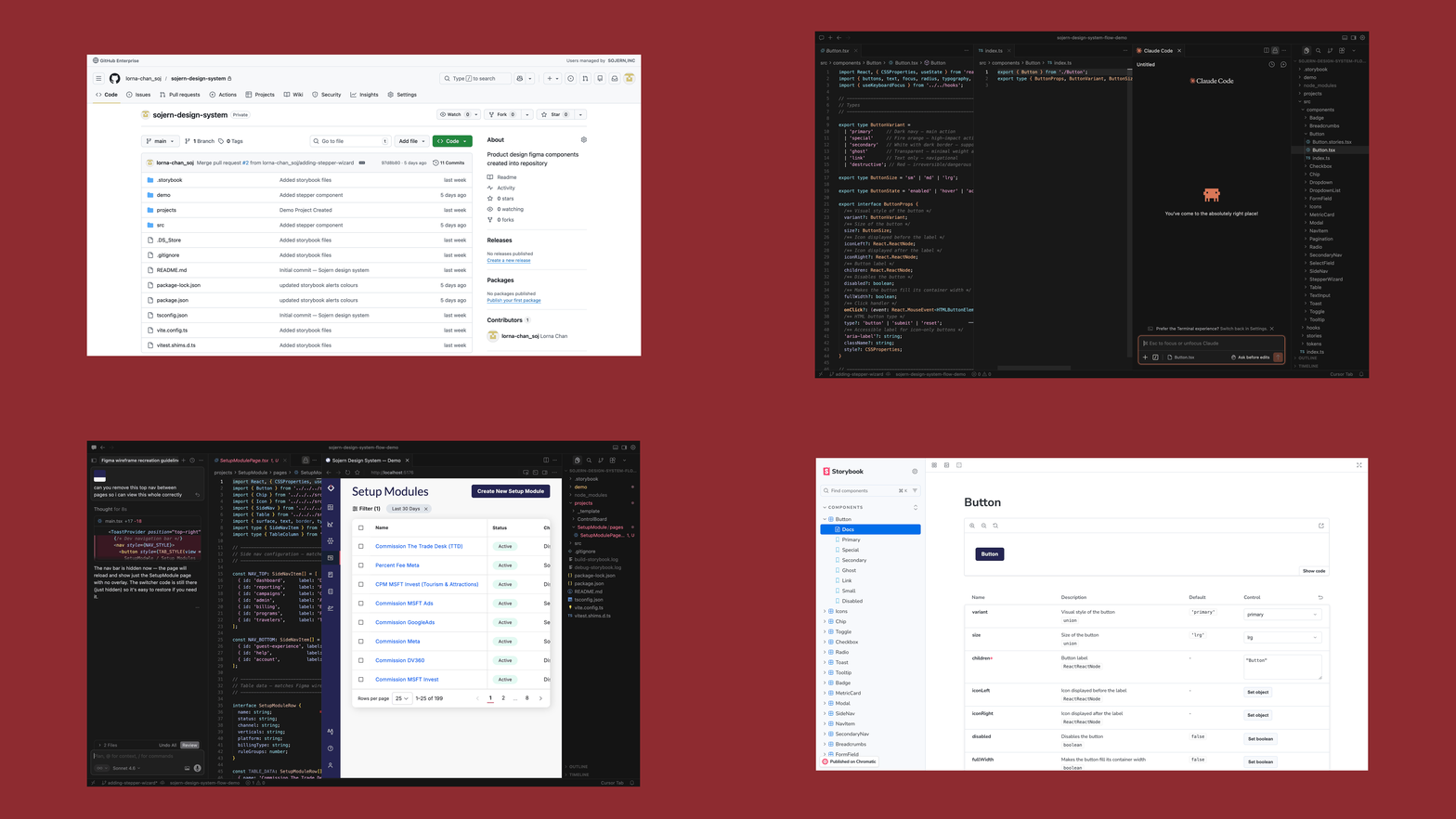
The lead product designer set out to test whether Cursor could reliably generate front-end code when working from a well-structured Figma library. Together we rebuilt a component library in Figma to be more "machine-readable", simplifying logic, standardising naming, and removing ambiguity, then used Cursor to generate a matching React component repository in GitHub, with Storybook layered on top so components could be viewed, tested, and documented in isolation. This got wireframe generation to 95%+ accuracy, and closer to 100% with additional prompting.
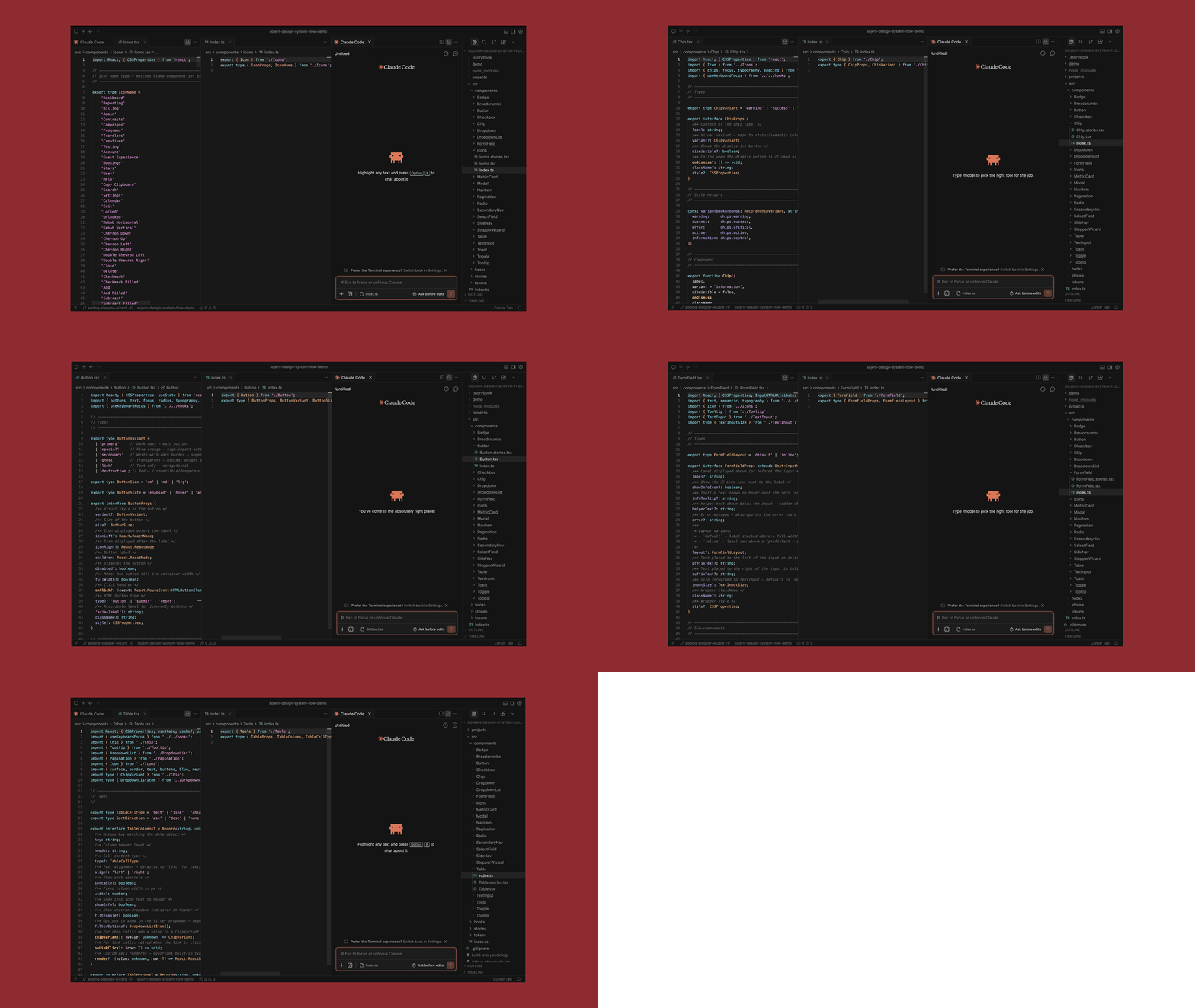
Using Cursor with Claude to generate React components from the Figma design library.
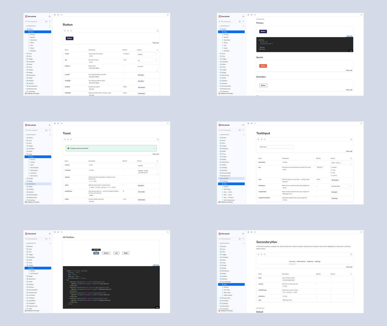
Storybook layered on top of the component repository for viewing, testing, and documenting components in isolation.
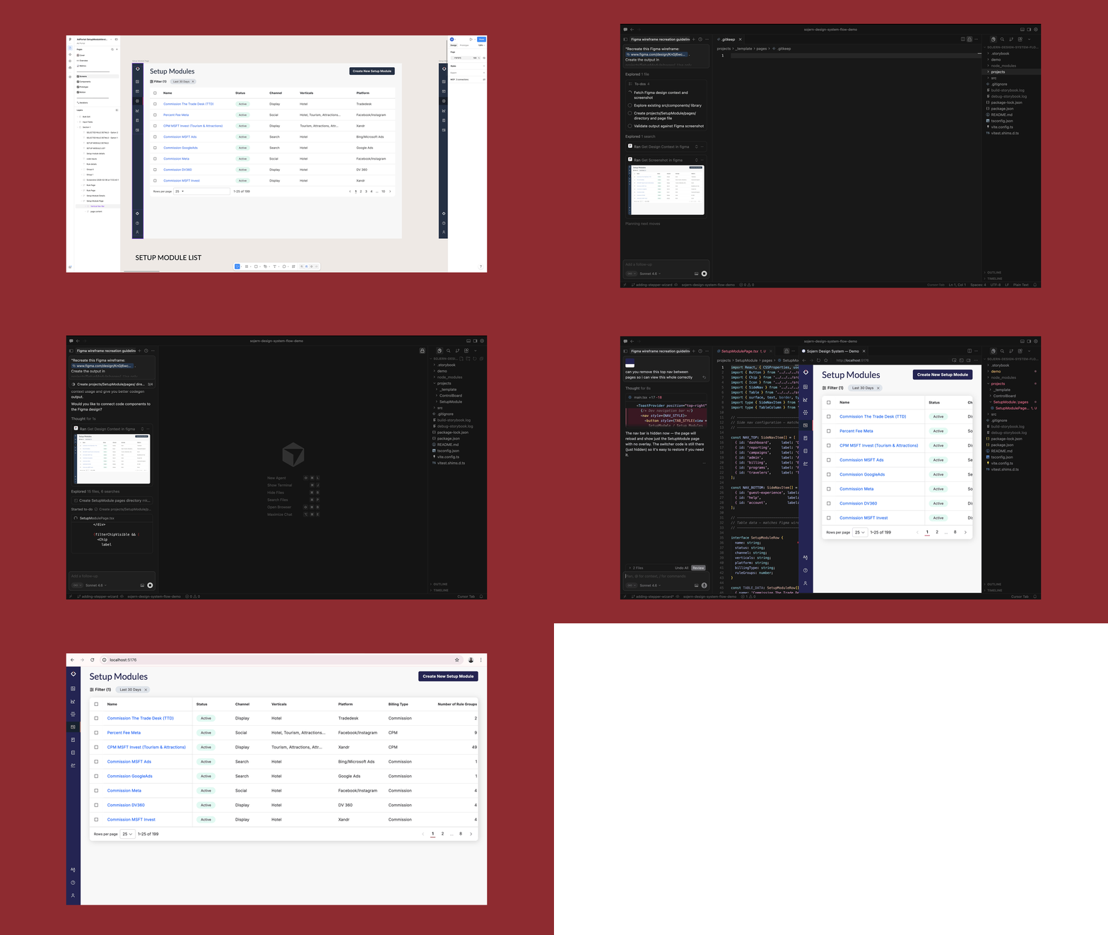
Cursor generating production-ready wireframes directly from the aligned Figma component library.
Alignment review
With that proof of concept as evidence, the lead product designer presented an alignment review to decide, as a company, whether to build a fully custom component repository or invest in aligning our existing MUI theme to Figma instead, laying out both as phased options with their own dependencies and engineering asks.
The custom-repository path would have required a component by component QA pass, a token pipeline for automatic Figma-to-code propagation, and a defined GitHub handoff workflow, all against the ongoing risk of MUI upgrades breaking overrides and drift compounding over time. Given engineering resourcing and the value of MUI's built-in support, the decision was to strengthen our MUI theme alignment rather than migrate to a custom repository.
Audit
We ran a full audit of Sojern's GitHub repository together, mapping it against Figma component by component to catch hardcoded values that should be tokenised, duplicate components, naming inconsistencies, and accessibility and state gaps, and reviewed the findings with engineering and the wider team to align everyone on scope and priority. From there we went deeper on each common component, producing a separate audit document per component with a visual comparison, identified gaps, and a distinct action list for Design and for Development, so ownership was clear on both sides.
Recurring gaps included hardcoded styling in place of shared tokens, missing or undocumented accessibility states, inconsistent naming between Figma and code, variant coverage gaps in both directions, and interaction or visual parity issues like misaligned button and icon treatment, colour mismatches, and unstyled table controls.
Working from that audit, I began implementing fixes in our Figma component library, then took on auditing the remaining components at the same level of detail, producing the same per-component documents with visual comparisons, gaps, and separate action lists for Design and Development. This gave design and engineering a shared, prioritised backlog of what needed fixing and in what order, rather than a general sense that things had drifted.
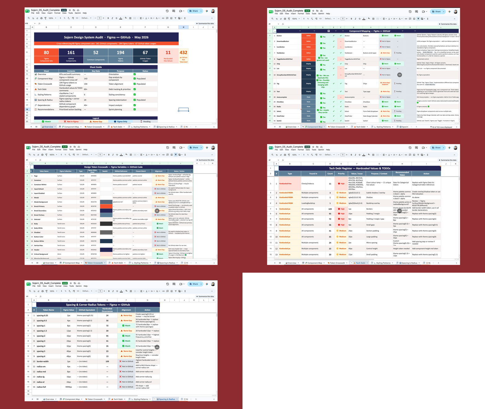
The audit spreadsheet tracking component mapping, token alignment, spacing tokens, and tech debt between Figma and GitHub.
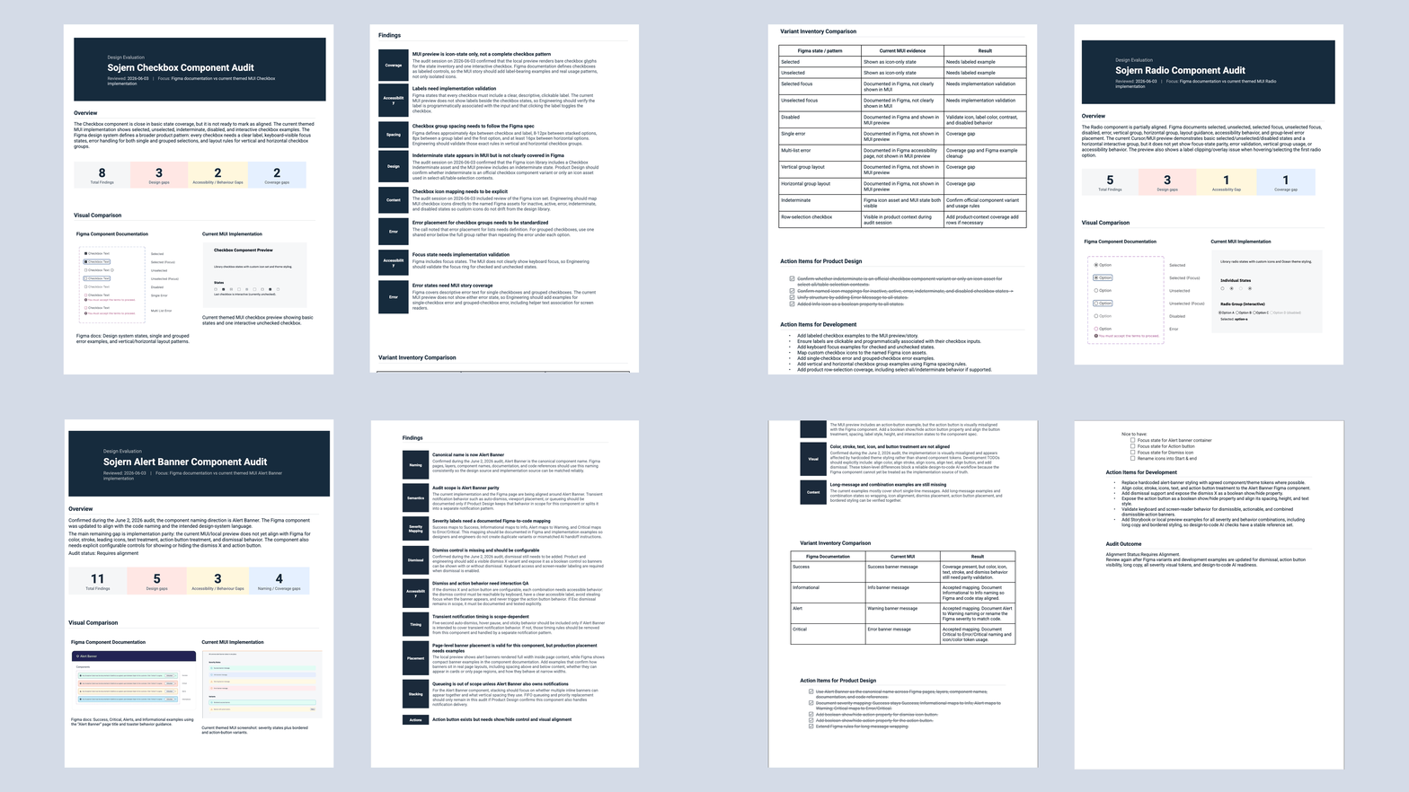
A component audit document, closing with separate action lists for Design and Development.
Figma library update
Alongside the audit, we updated the Figma component library, resolving naming mismatches, documenting missing states, and closing variant gaps identified in the audit, so Figma could act as a reliable source of truth. I did much of this hands-on library work.
Figma Code Connect pilot
We then piloted Figma Code Connect, starting with a single component (Button), to map Figma components directly to their code counterparts and test how well that mapping held up in practice.
Team documentation
To make the workflow repeatable beyond any one person, the lead product designer created team documentation covering how to set up and use Figma Code Connect, and how to use Cursor to generate front-end code from Figma components. I edited and iterated on the documentation with her, testing that the process actually made sense to someone following it rather than only to the person who wrote it, so other designers had a reliable reference for adopting the workflow rather than relying on tribal knowledge.
Tiger team formation
To carry the remaining work forward without a dedicated permanent team, we established a tiger team model: ownership rotates each sprint, and a rotating product team carves out bandwidth to contribute. This work is now underway, starting with aligning hardcoded values across GitHub and Figma before moving on to full component alignment.
Outcome / Current State
The MUI theme alignment effort is now active, led by a rotating tiger team working through hardcoded values first, then components, using the audit as its roadmap. The Figma Code Connect pilot on Button gave us an early read on how well Figma-to-code mapping holds up, informing how we'll extend that approach to other components.
On the horizon
- Extend Figma Code Connect mapping beyond the Button pilot as component alignment progresses
- Continue rotating tiger team ownership each sprint as hardcoded values and components are brought into alignment
- Revisit the phased MUI alignment plan as capacity and priorities shift