Unifying filtering across the Ad Portal
Why does every page in the Ad Portal filter differently?
The Ad Portal is where Sojern's customers and internal teams run campaigns and read their reporting, and almost every screen relies on filters. Those filters grew page by page, so users had to relearn them every time they switched sections. I set out to define one filtering pattern for the whole product.
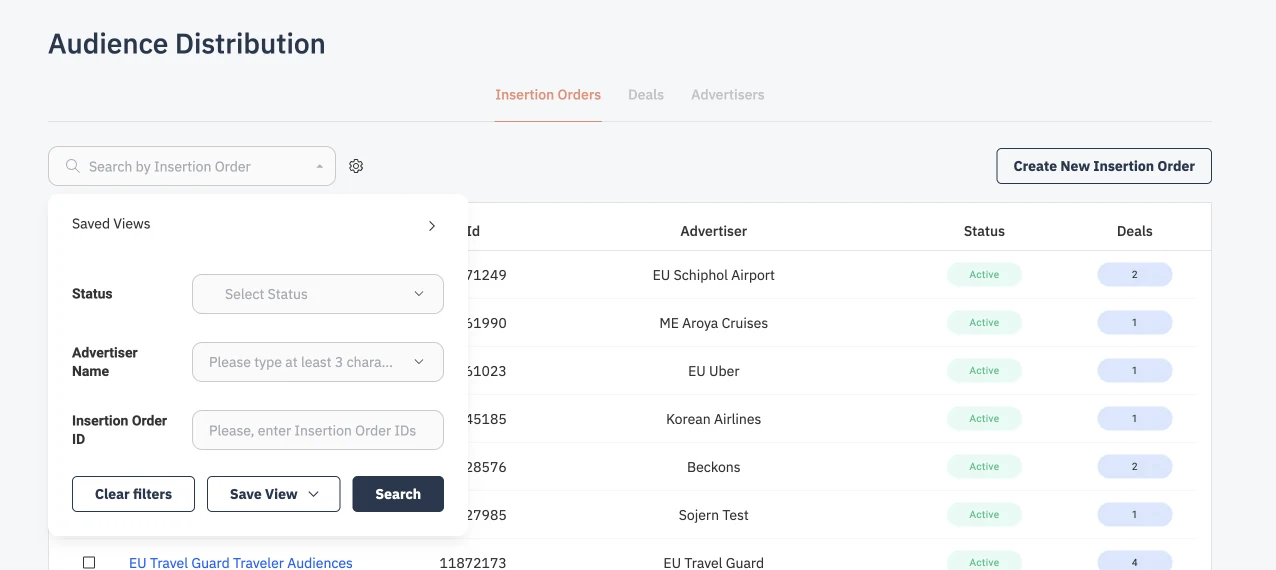
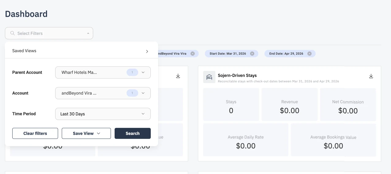
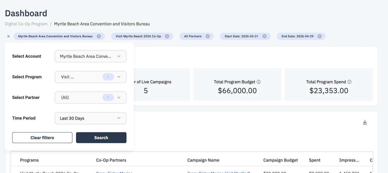
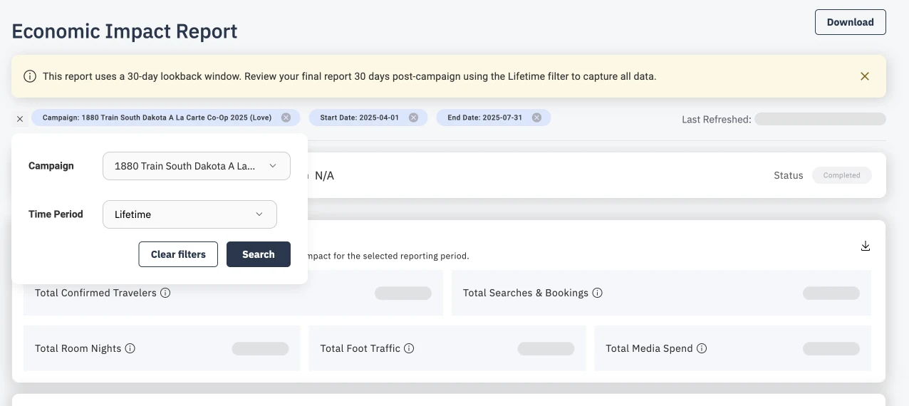
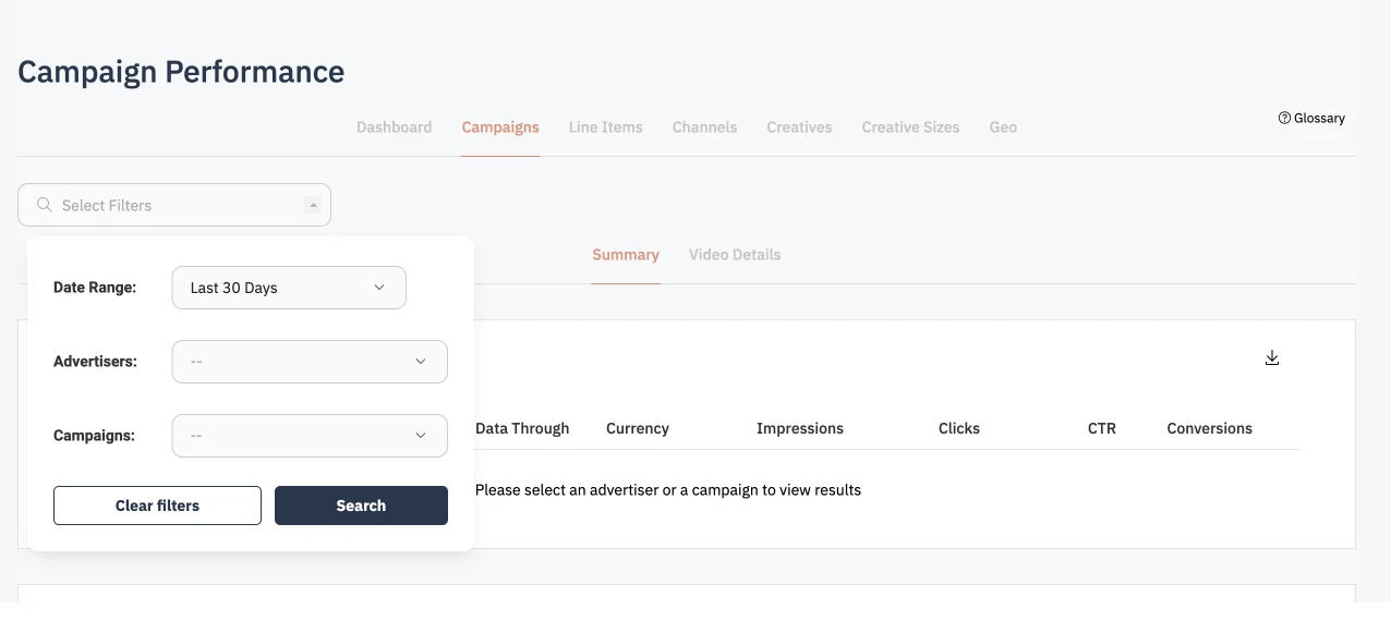
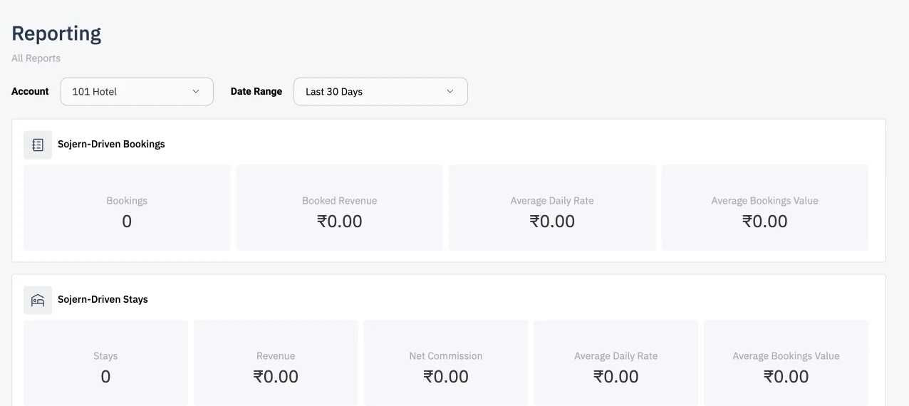
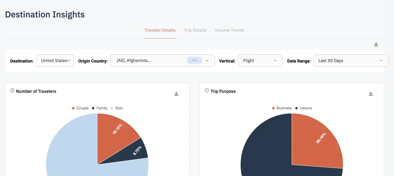
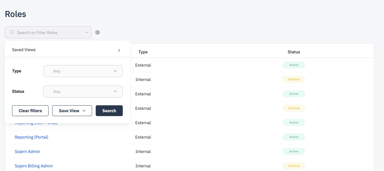
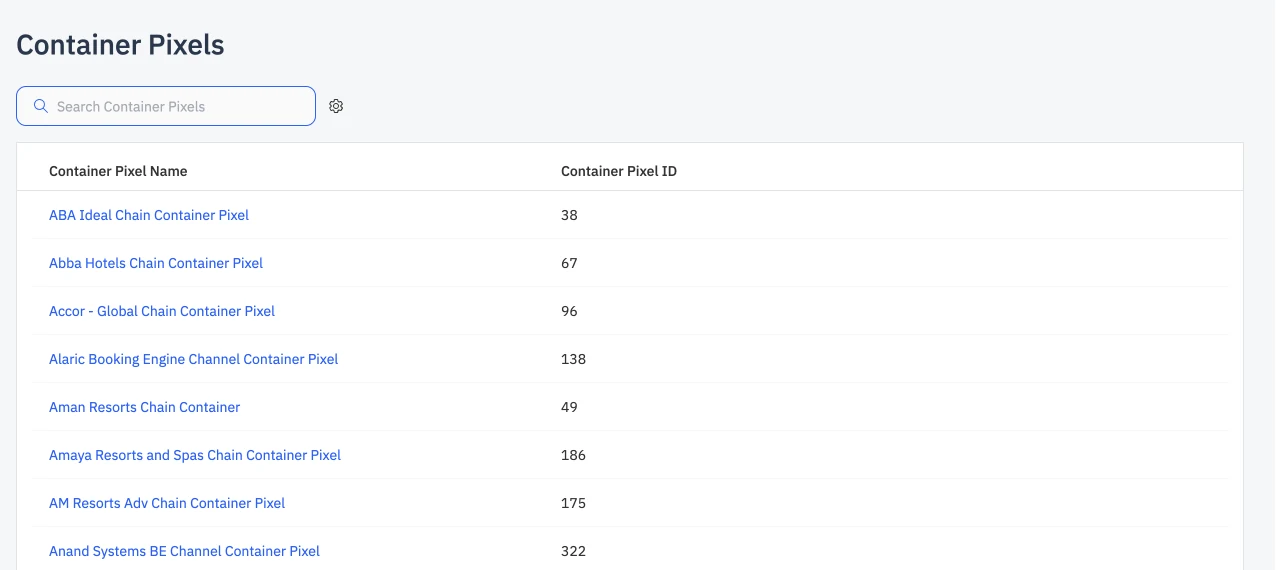
Before: filters on nine Ad Portal pages.
Before the redesign, every page solved filtering on its own. Some pages open a panel with Clear filters, Save View, and Search. Others offer only Clear filters and Search, place the filters inline above the data, or provide nothing but a search field.
After supporting the lead product designer in early research, I took ownership of the workstream: the design direction and a coded prototype of every flow.
The redesign: one filter bar for every page
In the redesign, every page in the Ad Portal filters the same way. Each part of the pattern answers a specific problem users reported in the survey.
One filter bar, in the same place on every page
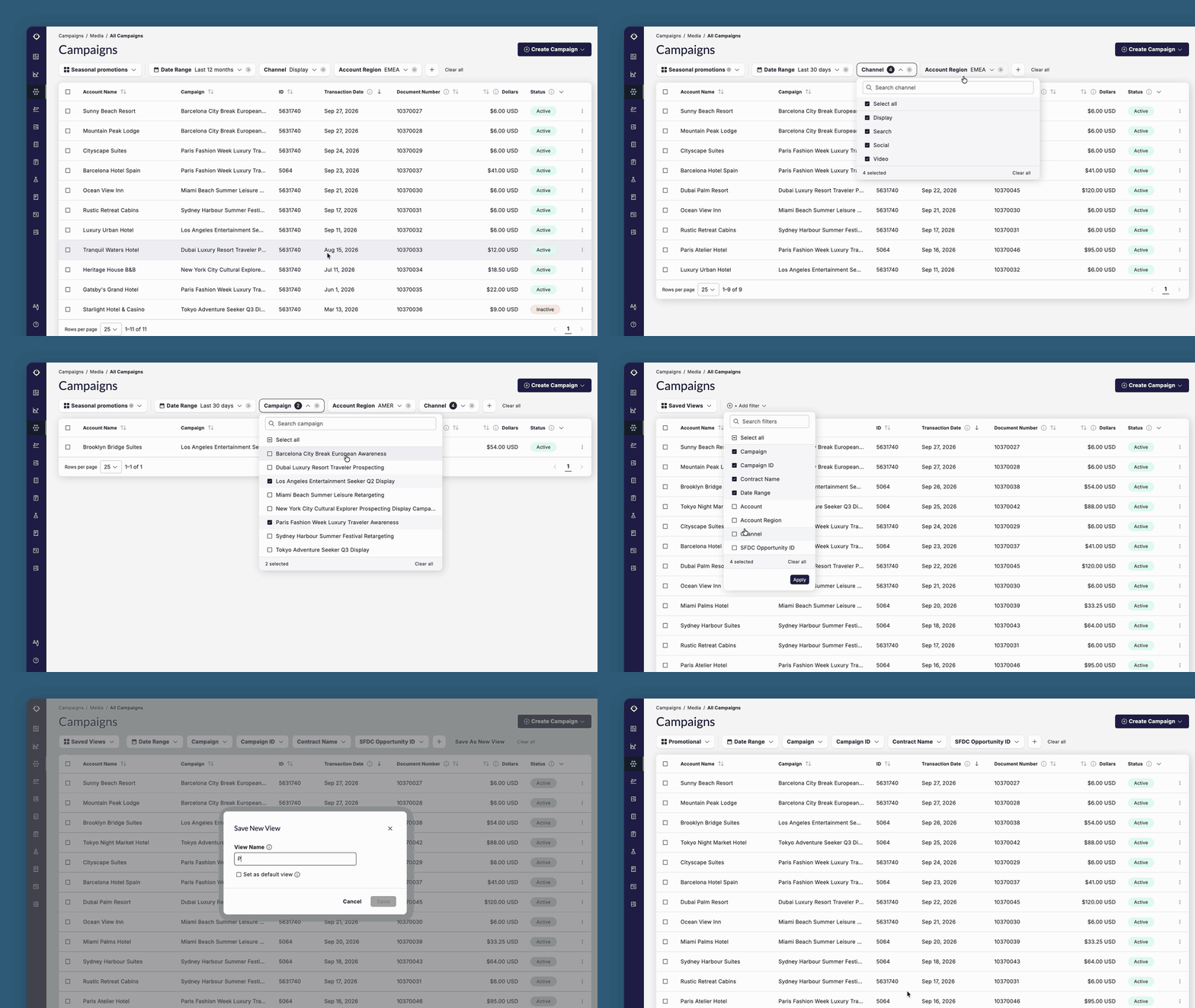
"Filters are different on each page" came up in nine or more responses. The new bar sits between the page title and the table, close to the data it affects. It always follows the same order: saved views, date range, the page's default filters, then the button to add more. Users learn it once and use it everywhere.
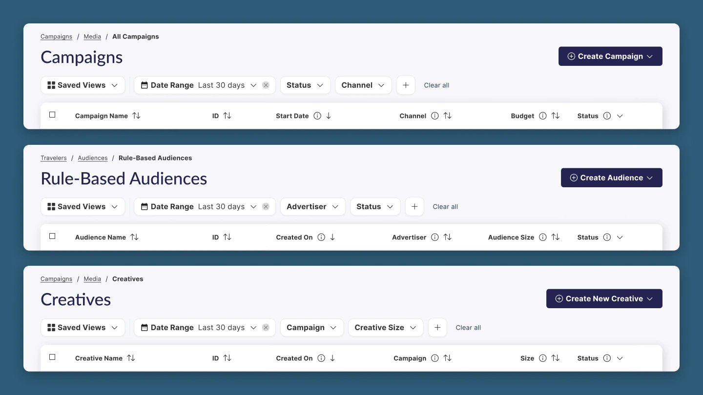
After: every page uses the same filter bar in the same place.
Applied filters you can read at a glance
Several users were unsure whether filters were applied at all. That puts users at risk of trusting partial data. Every applied filter is now a chip in the bar that shows its name and selected value, so users can see what is applied at a glance. Clicking a chip shows exactly what is selected, and a count badge marks filters with several values. Filters that don't fit on two lines collect under "+N more". It opens a panel that lists each of them with its selection. A "Clear all" link at the end of the bar resets everything.
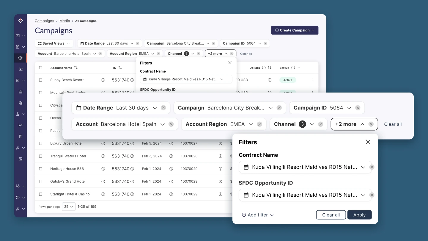
Every applied filter shows its value in the bar, and "+2 more" opens a panel with the filters that don't fit.
A way in that sits where users look
One user did not know filters existed on the Audiences page, because the entry point was a tiny arrow. The "+" button now sits directly after the last filter in the bar and reads "Add filter" on hover. It opens a searchable checklist of every filter available on the page, with the active ones checked at the top.
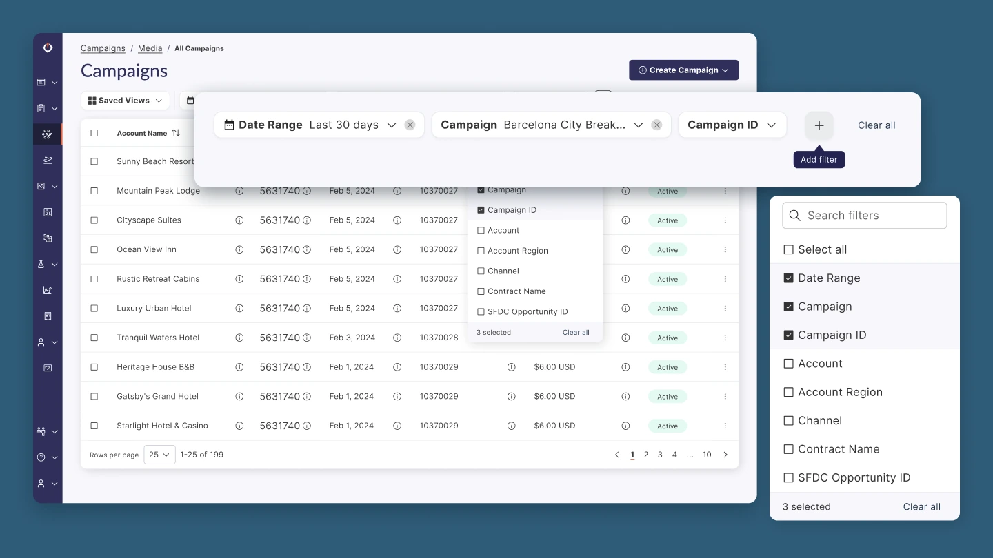
The "+" after the last filter reads "Add filter" on hover and opens a searchable checklist that lists the active filters first.
Saved views framed as saving the current state
Around 70% of respondents did not know saved views existed. Saved views are now the permanent first chip in the bar, and a "Save As New View" button appears as soon as users change their filters. That ties the feature to the moment it is useful.
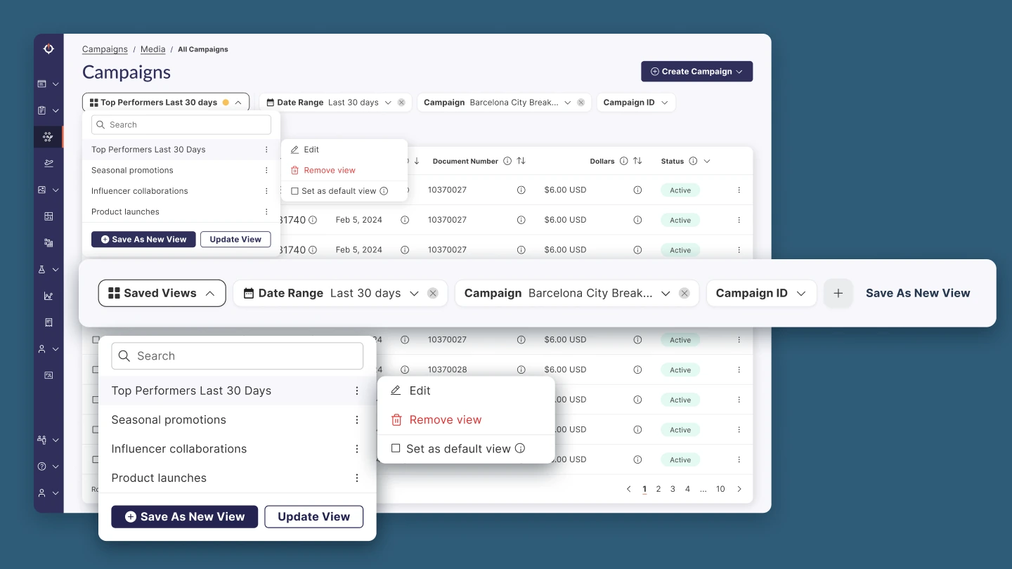
Saved Views is the first chip in the bar, "Save As New View" appears once the filters change, and each view can be edited, removed, or set as default.
How we found this
Together with the lead product designer, I ran a Google Form survey with internal Ad Portal users to surface the pain points with filtering across the product. Synthesizing the responses produced six takeaways, which I grouped by severity.
-
Inconsistency is the number one complaint (Critical) Filters differ on each page, so users relearn the interface every time they switch sections.
-
Saved views are nearly invisible (Critical) Around 70% of respondents did not know they existed.
-
Active filter state is unclear (High) "Selected filters aren't obvious" was a recurring pattern.
-
Discoverability fails lower frequency users (High) Infrequent users were missing the entry point entirely.
-
Users want filters close to the data (Opportunity) "Filters inline, close to the data they affect" was the most chosen placement, ahead of side panels or global dropdowns.
-
Date range should be first class (Opportunity) It was the most used filter. Several users said it should be a separate control that is always visible.
The decisions that make it one system
Where should filters live?
Users preferred inline filters close to the data they affect over side panels and global dropdowns, so the bar sits directly above the table. An earlier direction for that bar led with a large "+ Add Filter" button.
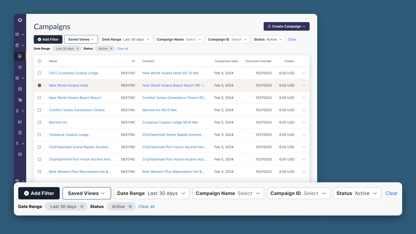
The first direction for the filter bar.
It also showed each applied filter twice: once in its dropdown in the bar, and again as a chip in a second row below. Users would have to read two rows to understand one filter. That is the exact problem the survey surfaced. Putting the value inside its own chip made the bar the single place to see what is applied and kept its height predictable on every page.
How does one bar work for pages with different filters?
Different pages need different filters, but users should never have to relearn where things are. So the structure stays fixed and only the content changes: saved views first, then date range, then two defaults chosen for each page, then "+" and "Clear all". When filters don't fit on two lines, the most recently added ones collapse into a "+N more" chip.
The default filters for each page are planned as the next step, once the project is picked up again.
Should date range be a filter like any other?
Date range appeared in nearly every response as the most used filter, so it gets its own chip with a calendar icon and always sits in second position. It is one of the default filters on every page and is set to the last 30 days. Users can remove it when they need to. Without a default, reports would load all historical data, which slows them down and puts unnecessary load on the system. Presets such as "Month to date" and "Year to date" cover the common cases, and a custom range covers the rest.
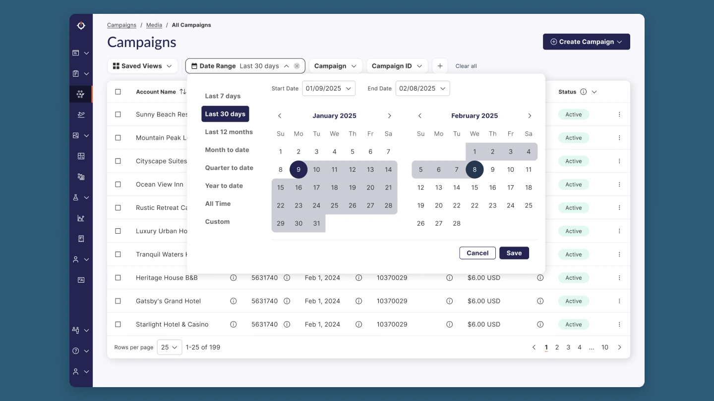
The date range picker offers presets for common cases and a two-month calendar for custom ranges.
Checking the design before calling it done
Once the flows were designed, I ran them through Design Evaluator, a Claude skill we built for Sojern's own design system. It reviewed the redesign frame by frame for usability, visual hierarchy, and accessibility, and assessed every screen against the survey pain points behind the project.
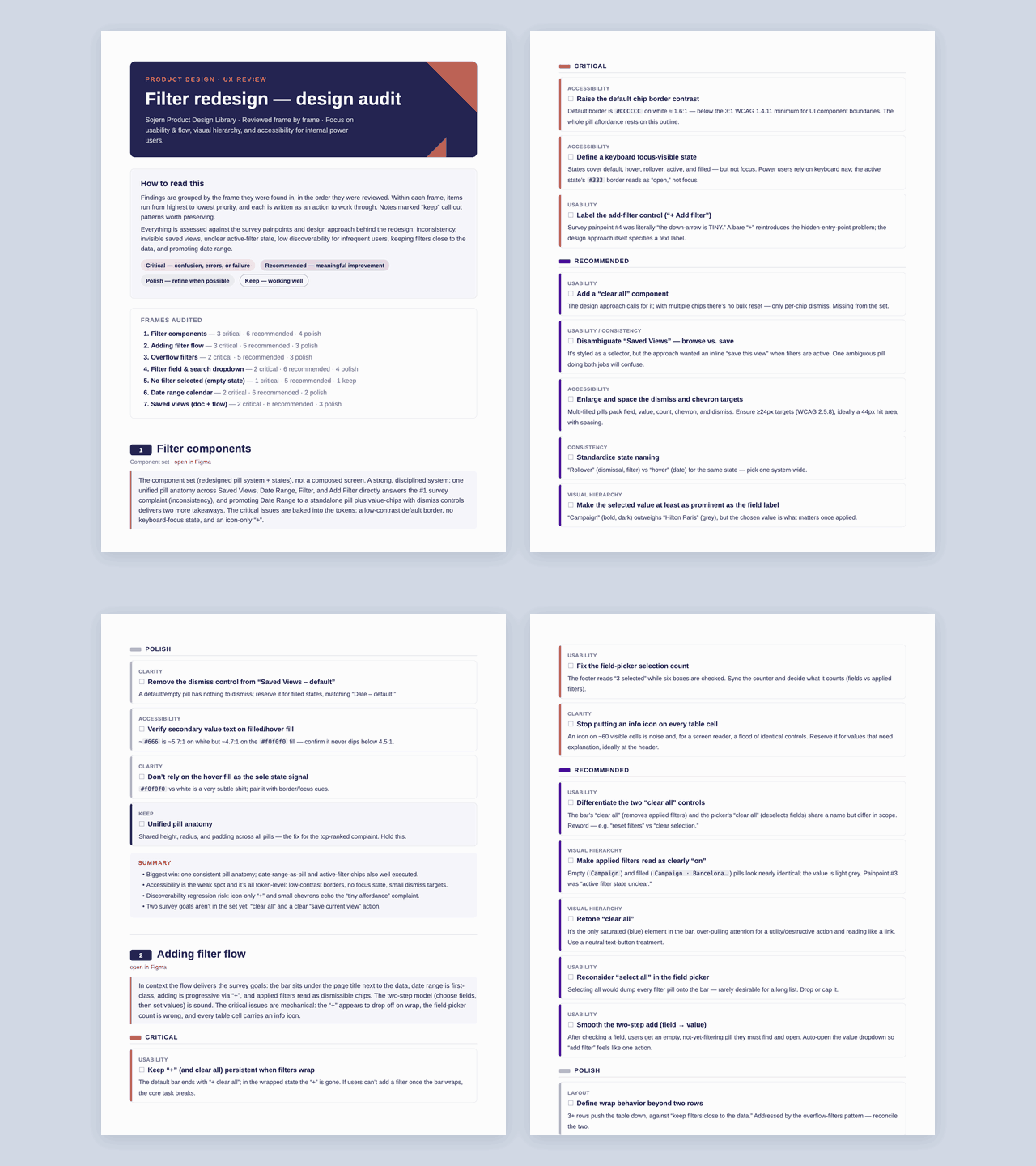
Design Evaluator reviewed each frame of the redesign.
I went through the audit together with the redesign and polished the design once more before considering it done. The audit also uncovered accessibility issues. Fixing them shaped the accessibility rules for the pattern: every control reachable by keyboard, chips announced with their name and value to screen readers, state never shown by color alone, and a minimum tap target of 44 by 44 pixels.
A prototype built from real components
I built the prototype in Cursor directly in our code repository. It serves two purposes: a realistic prototype for usability testing, and a starting point for the developers who implement the pattern.
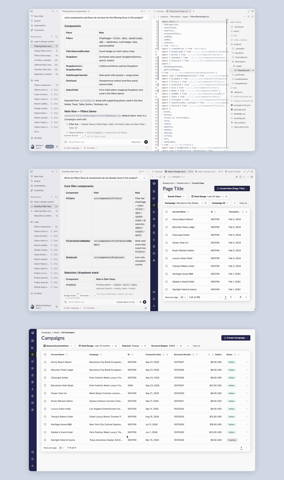
In Cursor, I mapped the existing filter components and built each flow next to the running demo.
Adding the missing components
The design system did not yet have the components the new filters needed. Using Code Connect in Cursor, I created the missing filter components in our code repository, so the prototype and the final product share the same building blocks.
Every flow, working end to end
The prototype covers all the flows from the design: adding filters, the overflow behavior, the date range picker, and saving, updating, renaming, and removing saved views.
Ready when testing starts
The prototype currently runs locally as a coded demo page. If the team decides to test the filters, it can be hosted and shared with participants as it is.
How we'll know it works
Product consolidation shifted priorities, and the project is now on hold. I handed over the designs with four success criteria. The designer who picks it up will decide whether to release it directly or test it first. I recommend usability testing with internal users against these criteria.
-
Users move between pages without relearning filters This was the number one survey complaint, and the unified filter bar addresses it.
-
Users can always tell when filters are applied Chips that show each selected value should make partial data impossible to mistake for the full set.
-
Lower frequency users find the way in We believe the "+" button next to the filters is clear enough, and testing should confirm it.
-
Saved views are discovered and used Placing them first in the bar and offering "Save As New View" targets the ~70% who did not know they existed.
What stuck with me
Designing for a project that might pause
Priorities changed before the project could ship. I had written the success criteria and built the prototype with real components, so the work can be picked up without starting over. It changed how I think about handover: make the work able to continue without me.